Posts Tagged ‘Web Design & Development’
Featured
Top 11 Advantages of Making Your Website Mobile Friendly
Why Your Website Needs to be Mobile Friendly
1. Most people choose to use mobile than desktop
More and more people are using mobile phones, smartphones, and tablets for years so you want to make sure they can access your business through their mobile devices.
About 2/3 of Americans own a smartphone and 87% of millennials have their phones at their side day & night. Click To Tweet2. Reduced load time
We all want to provide a good user experience. And one of the reasons why people leave the website sooner is due to its long loading time. Mobile optimized sites load faster so you’re one step away from losing a potential customer.
48% of users say they feel frustrated and annoyed when they get to a site that’s not mobile-friendly. Click To Tweet3. You’ll attract more visitors
Around 40% of the traffic to most websites is now from mobile phones. That means that almost half of your users need a mobile friendly website to engage with your business.
Many mobile users will simply click away from a page if it doesn’t respond the way they want it to on a mobile device.
79% of people who don’t like what they find on one site will go back and search for another site. Click To Tweet4. SEO benefit: Google ranks you higher
Another reason why you need a mobile optimized site is because it makes it easier for people to find you in online searches.
Google announced that from April 21, 2015 its new algorithm favors mobile-responsive websites. Also, in this way you won’t be penalized for having duplicated content.
5. Makes it easier to manage your content
Having a mobile friendly website allows you to save time, energy, and resources on publishing your content online. Aside from that, duplicate copies of your content is just hard on your search rankings so it’s better to have one website and develop a responsive design from it.
61% of people said that they’d quickly move onto another site if they didn’t find what they were looking for right away on a mobile site. Click To Tweet6. Mobile users are bigger buyers
Because of the fast-paced generation we are currently in, there’s a basic need for people to be informed instantly.
One of the benefits of mobile optimization is it makes mobile users want to read product reviews and compare brands faster and purchase whenever they want or need to.
67% of users are more likely to buy from a mobile-friendly site than a non-mobile friendly one. Click To Tweet7. Social media shares are huge on mobile
Using mobile devices makes it easier for website visitors to share interesting posts, pictures, and videos with friends. Notice how social media buttons are everywhere when you browse with your phone? Otherwise, the word SHARE is featured prominently on the article.
8. Lower maintenance cost
A mobile-responsive website may cost you upfront, but it has definitely much lower maintenance cost. For instance, you do not need to reformat, duplicate or add features to your content twice, like you would do using a desktop and a mobile site.
Consult some website technical virtual assistant services – they will help you transform your website and optimize it for mobile-viewing
9. Better back-linking
Aside from better search engine rank, a unique URL results in a stronger linking setup. All your backlinks will point to the same domain instead of being split between desktop website and mobile website.
10. It will help your website prepare for the future
As mentioned, increasingly more individuals are choosing smart phones and using tablets. It’s definitely a good business sense to provide them with the service they need to keep using your website.
50% of people said that even if they like a business, they will use them less often if the website isn’t mobile-friendly. Click To Tweet11. Don’t fall behind the competition!
Be ahead of the game. You don’t want to be the last one to update your website.
7 Examples of Excellent Mobile Website Design
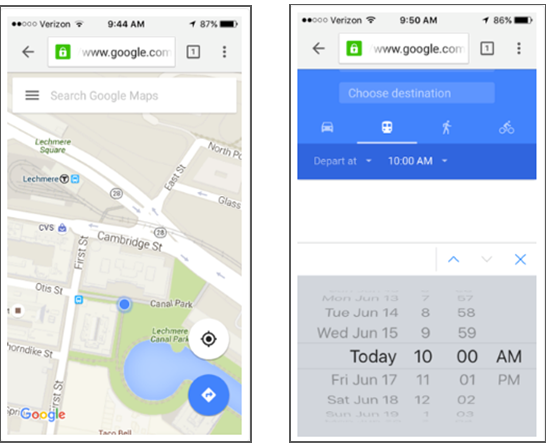
1. Google Maps
The mobile website has the speed and functionality of the app.
Source: blog.hubspot.com
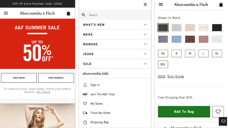
2. Abercrombie & Fitch
Abercrombie & Fitch uses simple color palettes with beautiful photography to draw the visitor’s eyes to the products, rather than the elements of the site.
Source: impactbnd.com
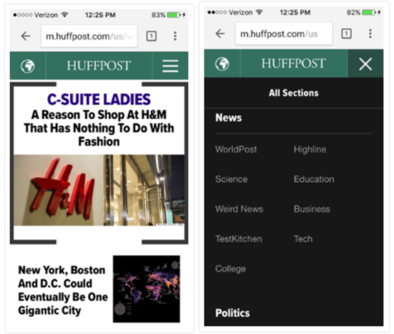
3. Huffington Post
Huffington Post actually alters their headlines slightly for mobile users so their content is more easily scannable.
Source: blog.hubspot.com
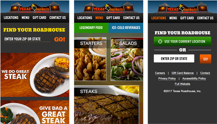
4. Texas Roadhouse
This mobile website does a great job of encouraging users to find a location nearest to them to visit.
Source: impactbnd.com
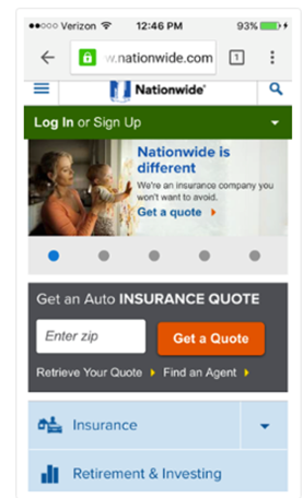
5. Nationwide Insurance
This one nails down the simple user experience. You can get an auto insurance quote right away by entering your zip code; or you can “Find an Agent” to learn more information about their services.
Source: blog.hubspot.com
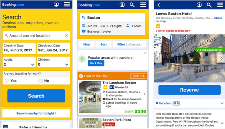
6. Booking.com
This popular booking site grabs the users’ attention and directs them to the form with a clear call-to-action.
Source: impactbnd.com
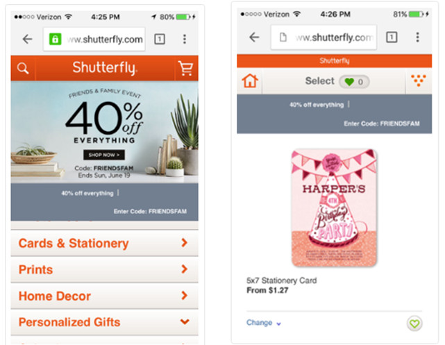
7. Shutterfly
Shutterfly is an online service where you can create photo books, personalized cards and stationary, and more. Their mobile-friendly website is:
- easy for users to find out information about their offerings
- designed with beautiful imagery
- equipped with menu items have been enhanced into large buttons
Source: blog.hubspot.com
Final TIP: There’s an easy way to check your website using Google’s Mobile-Friendly Test. See if there’s some work to do in order to maximize the mobile user experience of your website.
Need help with building website mobile-friendly? Our Web Design & Development packages can match you with a dedicated Web designer/ Tech virtual assistant to help create responsive-design websites for your business or personal page.
Talk to us today and let us know what you want to accomplish. CALL 1-866-596-9041 to learn more.
We would love to hear if these ideas worked for you! If you have questions or any business related success stories, please leave a comment below.
References:
https://blog.hubspot.com/
https://www.impactbnd.com/
https://www.godaddy.com/
https://blog.wsol.com/
http://www.seorankmonitor.com/
http://blog.pixelfish.com.au/
Featured
The Ultimate Guide in Creating A Landing Page That Truly Converts
Top Tips to Create an Effective Landing Page
Here’s a sample from WordStream of what an ideal landing page looks like and some samples of best converting landing pages…
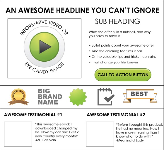
Source: WordStream.com
1. Clean and Organized Design
Whether it’s making a purchase, filling out a form, downloading a PDF, or signing up for a newsletter, always make sure for a visitor to convert.
A smart use of the following will help you design attractive landing pages:
- Theme colors
- Eye-catching images or videos
- CTA button colors, placement, and size
- Menu, sidebar, and other widgets
Here’s an example from Hotels.com
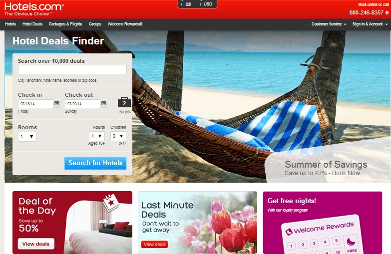
Source: Hotels.com via Buffer Social
2. Clear Call To Action
The mantra of your landing page should be as simple as ‘ABC’: Always Be Closing.
Buy Now. Learn More. Sign Up. Contact Us. See Our Samples. These are just some of the CTAs that are pretty straightforward. What do you want your visitors to do? That’s what you should be asking them, persuasively.
Don’t distract them with lots of other requests.
Below is a sample from Pocket. Notice how your eye goes right to the CTA?
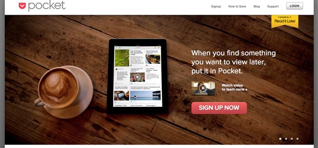
Source: getpocket.com via Kissmetrics
3. Detailed But Well Packaged Information
Rich and informative content will give your page an SEO boost and helps people who need to know more about your business before handing over their information.
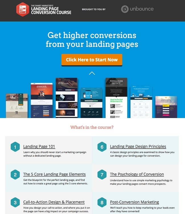
Source: Unbounce via Hubspot
4. Broadcast Offer Value Using Header
The headline and sub-headlines is broadcasting opportunity to promote the value of your offer.
For example…
Free LinkedIn Marketing E-book
Get more quality LinkedIn connections – fast!
Remember, you have about 8 seconds to convince users your offer is worth pursuing. Click To TweetSome landing pages choose the main headline to contain their main value proposition and use the sub-headings to discuss the actual offer. So it’s absolutely important that your value is clear and convincing.
5. Neat and Enticing Opt-in Forms
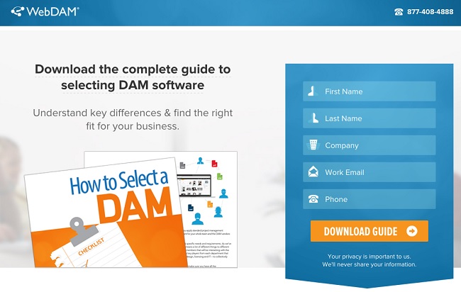
Take a look at WebDAM’s landing page. The form itself has an excellent contrast of colors and neat features like the little icons next to the info you need to put in. The form is also shaped like an arrow pointing down as a cue that you’ll progress to the downloadable guide.
Source: WebDam via Hubspot
6. Narrow Focus – Keep It Simple
Research shows that the more choices you offer people, the longer they take to make a decision.
- Keep copy brief and make sure everything is relevant to its purpose
- You don’t have to send all of the visitors to your home page. Create dedicated landing pages for your marketing programs
- Use visuals to keep the focus on the most important features of the page
- Set off the core space of the page with white space and move admin links to the footer
- Make sure any header or side links don’t distract from the main purpose of the page
Source: Salesforce via Kissmetrics
See how Salesforce did it. There’s no navigation bar at the top, the few company links are placed at the bottom, and the CTA is a bright, catchy, offer. Even the social links are small and grayed out so that the focus is narrowed to the form.
7. Testimonials and Trust Signals
Trust badges and user testimonials give visitors impression that your offer and brand are trustworthy. It works best if you display logos of well-known brands you’ve worked with in the past, certain endorsements and recognitions you’ve received, or groups/associations that you are a member of.

Source: WordStream.com
8. High-quality Resolution Layout
Always keep in mind the user experience and how visitors would see your landing page. Keep the most essential parts of your message such as the logo, headline, CTAs, at the center top of the screen, with supporting features on the rest of the page.
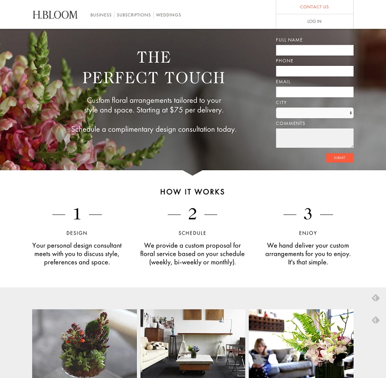
Think of an inverted pyramid where the most important elements are at the top. H.BLOOM’s landing page is an eye candy because it uses high-resolution photography and lots of white space.
Need guidance on crafting effective landing pages? We’re here to help! Our virtual assistant service will provide you with a dedicated web designer so you can see the most important features of your business come to life in PC, mobile, or tablet. CALL 1-866-596-9041 to learn more.
We would love to hear if these ideas worked for you! If you have questions or any website related success stories, please leave a comment below.
Reference:
wordstream.com
blog.kissmetrics.com
blog.bufferapp.com
blog.hubspot.com


